Not sure about backgrounds

Want to share your Moho work? Post it here.

Moderators: Víctor Paredes, Belgarath, slowtiger

User avatar
slowtiger
Posts: 6078
Joined: Thu Feb 16, 2006 6:53 pm
Location: Berlin, Germany
Contact:

Post by slowtiger »

What, you're colourblind?? *coughs* well ... in that case ...
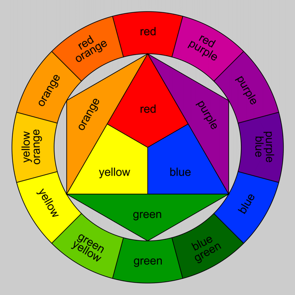
Use a colour wheel. Something like this:
Image
Now the only thing you need to know is that if you choose one colour, any colour on the opposite side will give the biggest contrast. Combine this with light/dark and saturated/dull contrasts, and you're mostly done.
User avatar
Mikdog
Posts: 1901
Joined: Tue Jul 05, 2005 3:51 pm
Location: South Africa
Contact:

Post by Mikdog »

AWESOME!

Thanks that makes a lot more sense now. Schweet.

Edit: Isn't it weird, the secondary, tertiary and tertiary in the top left of the diagram could be green or orange to me depending on how I look at it. Especially the tertiary in the outermost circle on the top left. Doesn't matter that I know its orange because of its place in the colour wheel, could most definitely be green. As well as the tertiary at the left.

edit2: in fact all these oranges look green. Somehow the greens don't look orange though. Bizarre. Thankfully I have a colour palette saved from another guy I used to work with. I've been using that palette in Photoshop for years now.

Thanks for the diagram, that's cool.
Acochran_89
Posts: 203
Joined: Tue Dec 09, 2008 7:38 pm
Location: Lawrence, KS
Contact:

Post by Acochran_89 »

Hey i'm color blind too!

That wheel is very helpful
User avatar
Mikdog
Posts: 1901
Joined: Tue Jul 05, 2005 3:51 pm
Location: South Africa
Contact:

Post by Mikdog »

Ha ha. Ya, well, hello my semi-colour blind comrade.

Here's the vid:

http://www.youtube.com/watch?v=tiEg9jOaeXA

Still looking to add some more 8-bit sfx to intro and outro. Thought it might be cool to get a human voice making them like 'bleep' and 'bloop'.

And a title card.

Thanks, that colour wheel helped. I went 'yellow, red, green, blue'. I used those exact colours besides the red which seemed to be a bit too saturated and wash out the backgrounds.
User avatar
slowtiger
Posts: 6078
Joined: Thu Feb 16, 2006 6:53 pm
Location: Berlin, Germany
Contact:

Post by slowtiger »

Uhm, your "yellow, red, green, blue" sequence in fact is "yellow, red, green, smudgy brown" ...

I like the vid. As usual you have put much more ideas into it than anyone else would do. And you have reworked the Frankenstein lab a third time! It's really spooky now.
User avatar
Mikdog
Posts: 1901
Joined: Tue Jul 05, 2005 3:51 pm
Location: South Africa
Contact:

Post by Mikdog »

Hi,

Thanks slow. Doh. Will recheck those colours. Maybe I'll use a lighter blue.

Yep, happier with the Frankenstein bit.

Peace,

Mike
User avatar
realsnake
Posts: 274
Joined: Fri Oct 05, 2007 8:03 pm
Location: timing&

Post by realsnake »

ccoolio, i'm gonna use this image as color palette in AS, thanks!:wink:
TreyRust
Posts: 13
Joined: Tue Aug 18, 2009 9:02 pm

Post by TreyRust »

the hose at 0:30 seems a bit out of sync... or it could just be me...

the animation at 1:21 might be a bit more satisfying if you had it look like she dashed to the other side with some blur...

and around 1:23 where he is running, its out of sync with the maraca... whether its supposed to be or not...

some of these may be on purpose, but I am just pointing them out...
yes, I am nit picking... but what else am I to do? its great otherwise!

P.S. with the intro, the 8bit black haired guy is on the right... but on the screen he is on the left... now THAT is nit picking :D
User avatar
Mikdog
Posts: 1901
Joined: Tue Jul 05, 2005 3:51 pm
Location: South Africa
Contact:

Post by Mikdog »

Thanks! Wow, you ARE good with details! I never noticed them standing opposite to their picture in the beginning. Hey, I should call on you more often. Thanks guy, you've got a great eye for detail!
User avatar
Mikdog
Posts: 1901
Joined: Tue Jul 05, 2005 3:51 pm
Location: South Africa
Contact:

Post by Mikdog »

Yo,

Another render I made last night:

http://www.youtube.com/watch?v=bc5j-RSHTHM

The blue I couldn't quite figure out. Photoshop has a composite mode called 'colour' which makes everything below it the colour of the layer. AS also has this mode. However in Final Cut Express 4 there's no colour composite mode, so I'm using overlay which comes close. Hence sometimes I get the muddy brown when I have a blue layer on top of an orangey background. Not sue if anyone knows a solution to this.

Was considering throwing a colour overlay over the whole thing to bring it together but haven't ventured there yet. For the last part I'm using a Final Cut Express filter called Bad tv, also not too sure about using this or creating some kind of effect manually.

Peace,

Mike
User avatar
slowtiger
Posts: 6078
Joined: Thu Feb 16, 2006 6:53 pm
Location: Berlin, Germany
Contact:

Post by slowtiger »

Just keep it as it is, there's enough bright blue in it now. I'm still not sure about the dull green sequence. Why is that so dull? I'd prefer something more freshly, lime-green, at least in one shot.

But: where are the stars? The passing-out-8-bit-stars? I demand them back!!

The 8-bit ending is perfect now. Keep it.

Something for the future: I keep stuff on different layers a lot. I would've done the BGs in 2 layers: stuff on one layer, shadows on second layer, everything else transparent. This way I'm completely flexible to do colour changes independantly on each level, or even add more stuff later. I also could set the shadow layer to multiply at 50% or so, which gives a great effect on textured backgrounds.

The colour trouble you experience now is a typical sign of too many effects on top of each other (not a really serious one though). It can't give the right result if it hasn't started with the right colour. That's why I keep line art and colour on different layers too, in PS or TVP: in worst case I could go back to the source file.
User avatar
Mikdog
Posts: 1901
Joined: Tue Jul 05, 2005 3:51 pm
Location: South Africa
Contact:

Post by Mikdog »

Hi Slow,

Hmm, keeping linework and colour separate would have been good.

At the moment I have backgrounds on one layer, shadows on another (set to darken mode), characters on another layer and front blurs on another layer.

The main character action is all comp'd in a sequence so I can apply a drop shadow and colour booster to the whole sequence which is useful.

The stars - they didn't want them and found them distracting. Oh well. I kind of liked them. But the sequence does look bleaker without them which I suppose is the point.

Thanks, I'll see about boosting the pale green. - yep, I think it looks cooler with a limeier green. Thanks ;)

Image

I also want to pimp this free cool 8-bit plug-in I found by Japanese band YMCK:

'Magical 8-bit plug'

http://www.ymck.net/english/download/index.html

I used it in GarageBand to make the 8-bit effects for the intro and outro (though not the 8-bit song. The other guys used the plug-in for some of the sounds in the song though).
User avatar
Mikdog
Posts: 1901
Joined: Tue Jul 05, 2005 3:51 pm
Location: South Africa
Contact:

Post by Mikdog »

Well, here it is:

http://www.youtube.com/watch?v=RAdX_nwXlrY

At 10 seconds the guy in the background is blurred when he shouldn't be and when AMy dances on the arcade machine she doesn't have a shadow. Might still change these.

Anyways, thanks for all the comments, encouragement, and you didn't see it but slowtiger gave me a whole bunch of suggestions in his pm's which I used a LOT. So, thanks.
User avatar
madrobot
Posts: 667
Joined: Mon Apr 07, 2008 3:07 pm

Post by madrobot »

That's really amazing and awesome dude.
Well done.

edit: Wow! How did you do the 8bit parts?
It looks like it would have been pretty painstaking.
Awesome result though.
Post Reply